
You have a great picture with great colors. You are adding design elements and copy on top, but how do you make sure the colors you use are just as amasing as the ones from the image?
If you’re reading this article on your laptop or just not using our app (because it’s not launched yet, perhaps 😅), let me direct you to Adobe Color CC (formerly Kuler) as it is our favourite tool. There are many other tools online for picking colors from your image. Just google “palette generator image” and you’re good.
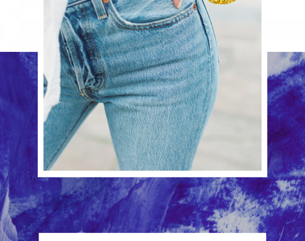
Let’s pick a great image to play around with. We’re feeling artsy 🖌 today.

Photo by Jason Leung on Unsplash
I picked this one because there’s some interesting accents in it. So if you’re not getting results just as awesome, this is how I cheated 😉.

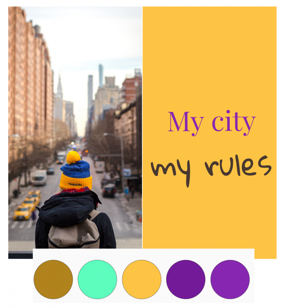
This is what Adobe Color generated
Sometimes using exact colors from your image renders good results. But sometimes you want to spice it up with colors that work well with your image, but are not necessarily present in your image. I’m guessing most people know what complementary colors are, but there are many more beautiful harmonies our there.
This is essentially what Adobe Color does on the “Color wheel” functionality. You can pick from Analogous, Monochromatic, Triad, Complementary, Compound and Shades. I found a great article that explains how they work from LifeHacker – dive deeper if you want!
Harmonies at PostMuse
We think this kind of “automagic” color generation from your image and beautiful color harmonies are really cool. We think these things are so cool, in fact, that we worked hard on bringing this kind of magic close to our users.
This is the first article about our app, and we are actively working on it, so don’t get too attached to the images we post here. Most probably the final app will look a lot different. But we want to include you in our journey, so here is a sneak peak!

I choose a side-by-side template for this image as I thought it’s a good fit. The colors for the text background is the same color as the hat.

And the text color is part of the “Triad” harmony. I tried different things and I ended up with this result. You might want to do things differently. We want to make sure we empower you with the right tools.

If the colors we picked and generated for you are not doing the trick, you can, of course pick a totaly custom color. Don’t mind the boring picker 🎨 – we kept it this way because most people know how to use it.

If you have thoughts or opinions, let us know on instagram. If you want to try the app, we can make sure you are one of the few first that play with it if you give us your email (We promise no junk mail – we hardly have time to write these articles 😅).